Dynamics 365 Portals is an amazing tool any organization with a D365 enterprise license can utilize. However, its OOTB design leaves several things to be desired. The following will help a technical user create something a little more appealing quickly and enhance the base functionality of the portal.
Following this guide will provide knowledge of:
- Dynamics Knowledgebase Configuration
- Liquid Template Development
- FetchXML
Perquisites:
- Dynamics 365
- Installed Customer Self Service Portal (guide from Hitachi)
- Somewhere to Host Web Images
- General understanding of how Portals works.
The Goal
For everything great about Portals, the homepage you get when installing the solution is not exactly the best user experience to funnel community users to the information that is most relevant to their needs.
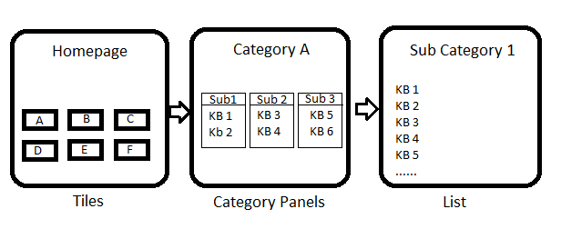
To improve this let’s implement a 3-tier category hierarchy in the portal for our users. The homepage of the portal, should be quick and to the point with graphical tiles as a first route to articles similar to Microsoft’s own support site.
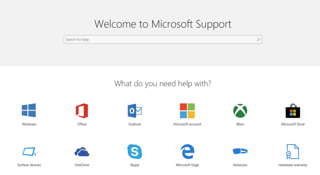
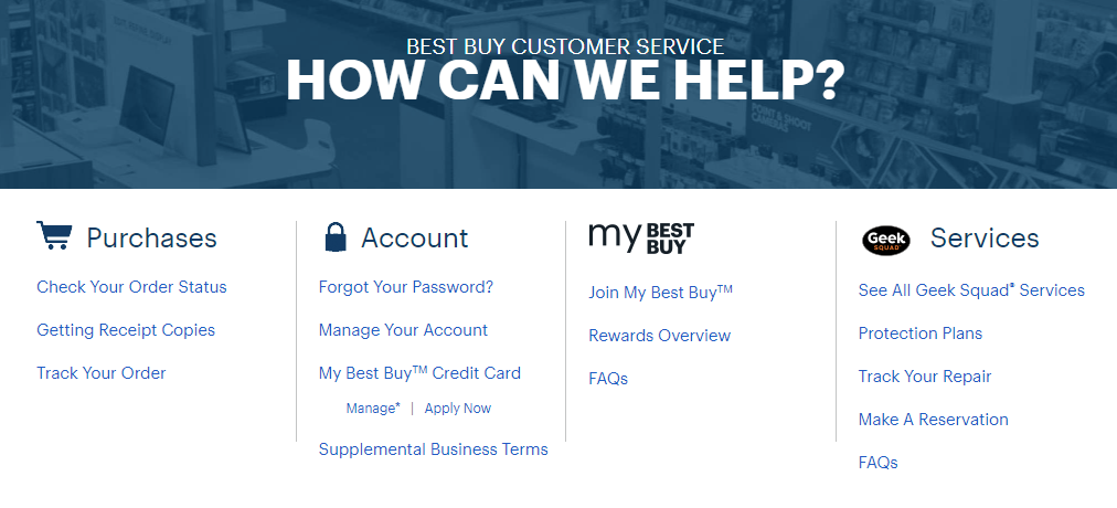
Best Buy’s customer support page also provides something that would make sense for a page that featured top KB’s grouped by category. Theoretically, on a homepage a user see’s graphical tiles for A,B, and C like Microsoft. When they click on A they are presented with categories X,Y,Z which are all children of A much like Best Buy.
Since what will be our second page still has categories, if a user clicks on one of these, and not the KB’s themselves, I think it is acceptable for the user to now see the OOTB list hierarchy that Portals comes with. Once in the weeds, users are used to finding the specifics they need and should not be burdened with a long list since they have already filtered twice.
The general application use case is as follows: